Law firm branding is big business, but it can also be fraught with difficulty and potential disaster.
There are various issues that can arise if law firm branding is not handled properly. So a kind of case study of how to do it properly was displayed by Ross Fishman of Fishman Marketing who launched five litigation websites that all appeared similar, but – as is always the case in law firm marketing – each firm wanted to highlight their own, unique selling points – their USP.
Here’s the Fishman release:
On the surface, the five law firms seemed relatively similar — dynamic boutiques led by tough, trial-oriented killers who routinely give opposing counsel the fight of their lives. But they were each much more than that. Each firm’s brand needed to showcase its unique style, approach, personality, and differentiation.
More than just a logo, a Brand is the promise a firm makes to the marketplace. It’s the whole package, i.e. the strategy, theme, layout, graphics, headlines, tag line, logo, etc.
Looking at their original websites and marketing, the firms looked superficially interchangeable. But after conducting an exhaustive series of in-person interviews, it became clear that the firms were quite different. Here are their stories:
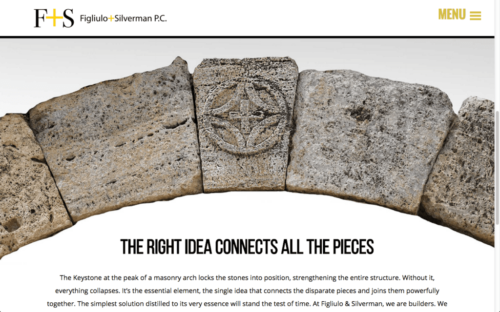
1. Figliulo & Silverman
Jim Figliulo is often described as “the smartest guy in the room.” His strategy in winning seemingly un-winnable cases is to find the one positive, dispositive fact, document, or element, and mercilessly hammer that point to the jury.
In our intake interviews, it sounded to me like an “If the glove don’t fit, you must acquit” philosophy. Gentleman Jim’s genius is finding and advocating that elusive issue, that “Winning Truth.” Pete Silverman works similarly, but in practice he’s also a friendly bully, happily hammering away until the other side simply gives in. These philosophies pervade the entire 15-lawyer firm’s approach.
The branding message is “Every Case Has A Winning Truth.”
Text: “It may be hidden by complications, difficulties, or seemingly insurmountable obstacles, but there is always a truthful position that would allow you to succeed. We must find that truth, have the strength and wisdom to advocate it, and thereby craft a just and genuine victory.”
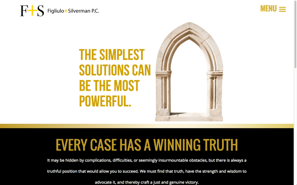
We designed the website around two architectural metaphors, the Arch and the Keystone.Each represents a single, seemingly simple idea that enables a larger, more complex construction:
“While the arch is one of the simplest architectural ideas, it enabled ancient architects to build soaring cathedrals and the monumental Coliseum. The same can be said of litigation, where the simplest idea can often be the most powerful.”
(See the full marketing campaign here.)
2. Howard Law Group
Bill Howard is the hard-ass trial lawyer; Jean Howard is the writer and strategist, although a skilled trial lawyer in her own right. Bill’s lifetime record in big-case jury trials is 300-4. That’s three hundred wins against just four losses. Astonishing.
Fishman Marketing’s First Rule: “If you have the facts, USE THEM.”
So we did — we led with Bill’s aggressive trial skills and 300-4 win-loss record. Clients come to them when they can’t afford to lose, and the tag line reinforces the nature of their work: “When Everything Is On The Line.”
“The Howard Law Group takes on the toughest, most sophisticated cases … and we win.
In fact, we haven’t lost a big trial in over a decade.”
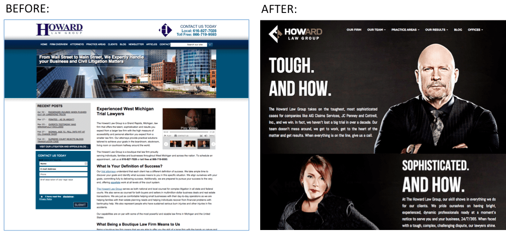
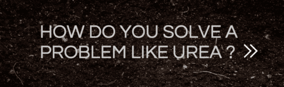
Bill’s a physically intimidating guy – strong, burly, with a fierce gaze and shaved head. Their previous FindLaw website failed to capture the firm’s swagger or success. So we tightened up the message, leveraging the “How” in “Howard” for added memorability, and made them look as tough as they actually are. The home page leverages our gritty fashion photography, supported by three scrolling video case studies detailing their recent wins (“How do you solve a problem like Urea?”).
Consider that this website looks nothing like the Figliulo & Silverman site. Because in truth, although they’re both highly skilled firms, they’re also quite different. (More about them here and here.)
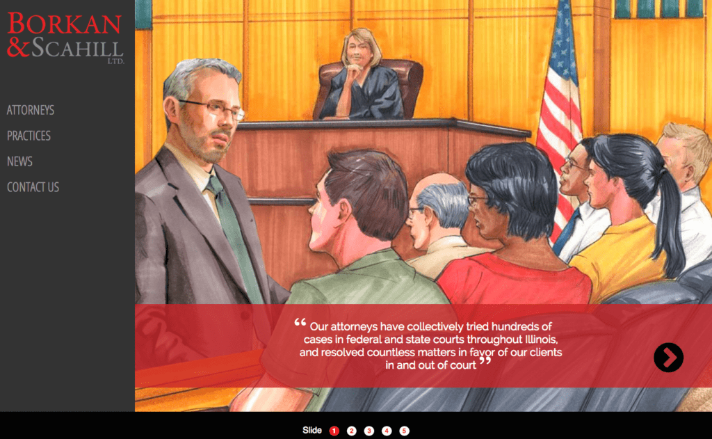
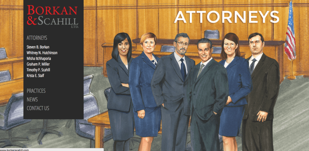
3. Borkan & Scahill
Steve Borkan is the charming, chatty trial lawyer, a glib, gregarious former actor and nationally ranked trampolinist. Tim Scahill is a skilled trial lawyer and the firm’s brilliant strategist and writer. They handle large, politically sensitive insurance-oriented cases, often on behalf of municipalities, police departments, and other agencies.
For their understated target audience of local governments, we wanted something that conveyed the firm’s powerful trial skills, without appearing too cute or clever. We designed the website using actual TV courtroom sketch artists who drew some of their biggest trials. We captured the sophistication of their work by the functionality of the website — a laterally scrolling layout with 3D parallax movement. The lawyers seem to glide into the background sketches. (See the full marketing campaign here.)
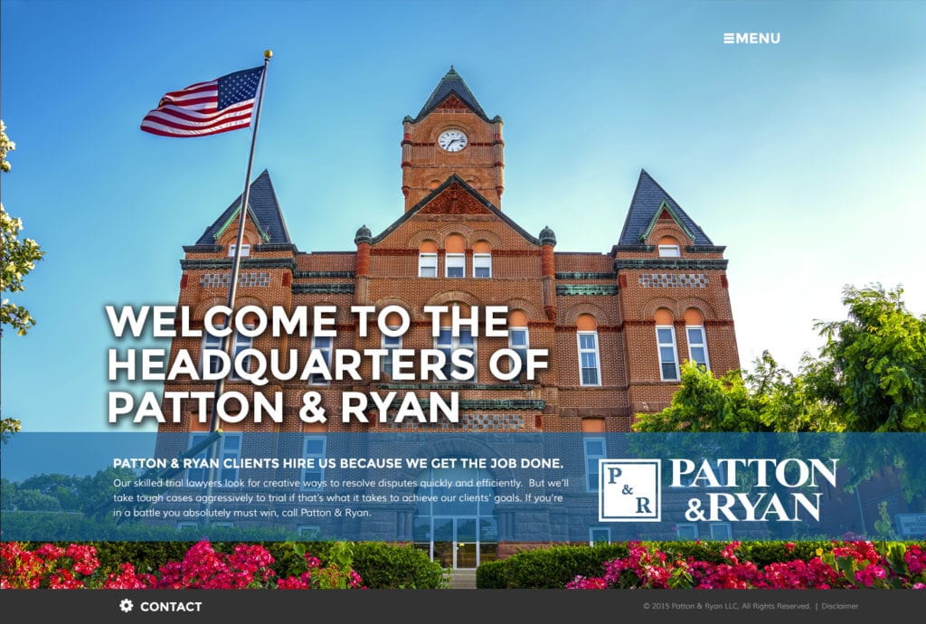
4. Patton & Ryan
John Patton’s insurance-defense specialty is parachuting into multi-million dollar cases at the eleventh hour, to support existing counsel or simply first-chair the trial if they don’t have the skill set. Jim starts at least one high-profile, 7-to-9-figure trial every single month, nationwide.
They wanted a simple but sophisticated WordPress site that reminded the insurance company lawyers that they handle cases across the US. To convey that message, we illustrated the home page with a variety of the beautiful, far-flung small-town courthouses where they’ve tried major cases. The headlines overlaying those courthouses make the point: “Welcome to the Headquarters of Patton & Ryan.”
5. Schlapprizzi Catholic Injury Lawyers
The Schlapprizzi Law Firm is one of the St Louis area’s leading personal injury and medical malpractice firms. Don Schlapprizzi had a strong local reputation, and his two skilled children had joined the firm. Personal injury is so competitive and costly to market, we recommended marketing smaller, less-competitive practices or targets, where they could build market leadership.
Meeting them, it was clear that they were a close-knit, devoutly religious Christian family.
In addition to continuing to seek lawyer referrals, we saw an opportunity for them to target a narrow audience with which they had similar values. We wanted them to become the go-to injury and medical malpractice firm for the region’s Catholic community.
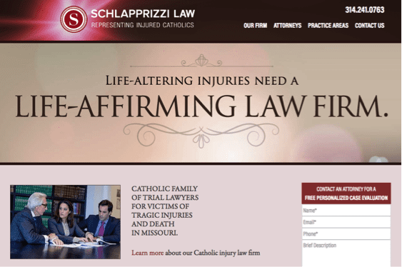
For this audience, a “tough” message wouldn’t resonate; we wanted to be skilled but understanding.
We sought to connect personally with this community. We left their existing general website untouched, and designed an inexpensive WordPress micro-site targeting this audience (catholicinjurylaw.com), with five rotating religiously inspired legal headlines. Supplementing the primary print ad campaign in the archdiocese newspapers are inexpensive inch-high strip ads that phonetically pronounce the complicated firm name. (See the full marketing campaign here.)

So what’s the point? Every firm is different.
There’s always something that makes a firm unique. Do you know what yours is? If not, it’s our job as the branding experts to identify it, then tell that story using the full range of print and online marketing tools.
Sometimes a firm knows precisely who they are; more commonly we have to help them find it. That’s the Art in the branding process. Only after we’ve discovered the brand are we in a position to convey that message creatively and effectively.
It’s why we conduct so darned many in-person, one-on-one, intake interviews.
It’s more time consuming that way; many branding agencies prefer to conduct these interviews over the phone or in groups. Frankly, I don’t think that works. Lawyers don’t tell the whole truth in large groups; they’re more guarded. In my experience, only by hearing each lawyer proudly tell their own story, can you gradually elicit the connective tissue that binds them all together. Rarely can the lawyers initially voice it, but they’ll recognize its truth when you reflect it back to them later.
But without that step, you can’t find the firm’s culturally connecting thread. This means you’re stuck illustrating vague generalities like “Litigation.” Or “We’re different.” Or “When success matters.” (It’s litigation, for goodness sakes. When doesn’t success matter?)
Generic messages lead to equally generic visuals like skylines, gavels, columns, and scales of justice. And once visitors see that meaningless crap on a firm’s home page, they implicitly understand that there’s nothing inside the website that’s going be of any interest or value.
Interestingly, great trial lawyers follow a similar process.
They first look at all the facts and identify their “theory of the case” — the message they’ll use to persuade the jury to find in their favor. Only after they identify that story will they take the next step and craft their court pleadings.
In Marketing, we don’t have a “theory of the case,” but we do have a “branding message.” And without it, what’s the point? Our job isn’t to make pretty pictures; we want our clients to dominate.