An exclusive, disruptive and indispensable brand with creative, jovial and hard-working people: from this narrative of legal practice Harmos Horton Lusk (HHL), the initial concept for the firm’s architectural transformation was conceived as ‘Traditional with a Twist’.
When HHL sought out Warren and Mahoney, the firm occupied a prominent position on the 37th floor of well-known Auckland tower the Vero Centre, with panoramic water views. Rather than big change, it wanted to move to a larger floor plate on the 33rd floor and turn its incumbent, successful working model into an exceptional space.
Add a design team at Warren and Mahoney, led by principal Scott Compton, who knew the building intimately, those Waitematā Harbour views and a vast collection of New Zealand art collected over many years by HHL, and the ingredients were there for an exceptional result.
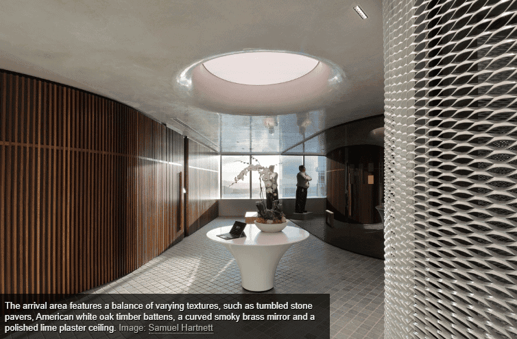
Compton describes planning the new office as “a game of Tetris”, with three distinct spaces – an arrival area, a central amenity space and a working area. As one exits the lift, the natural materials of the lobby immediately cleanse the palate to prepare for an entrance into the cobbled arrival area, which feels like an external courtyard. (These floors are Compton’s favourite part of the project: “We wanted a cobbled environment because we wanted to internalise the outdoor experience. There is no shine on that floor at all. It absorbs all the light.”)
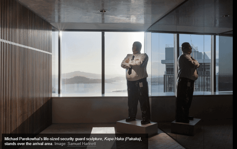
Curved walls, clad floor to ceiling in white expanded mesh, smoky brass mirrors and warm timber battens ensure the space unfolds graciously. The unexpected materiality of the walls draws the eye to Michael Parekowhai’s life-sized security guard sculpture Kapa Haka (Pakaka).
It feels private and nest-like but the mystery of the space deepens on closer inspection; through slithers of glazing and small perforations in the extruded mesh, masked meeting rooms reveal themselves beyond the sweeping walls.
Bespoke, solid and white, an unmanned reception desk is the next object that is registered, occupied by just a tablet and a plant. Above this bare-but-inviting creation is a large light feature, mimicking the diameter of the table and giving the impression that the desk has fallen from the void onto the cobblestones. The light streaming down from the feature manages to appear as though it could be daylight pouring in.
Through a tall, heavy door, the transition into the central amenities space occurs. The space retains the cobblestones underfoot and the polished plaster ceiling (with its muted, reflective nature, which perfectly juxtaposes the floor) from the arrival space. Soft green fabrics and furniture (a visual delight that is a who’s who of New Zealand furniture-makers), banquette seating, warm, honey-like crown-cut timbers, and a wall of encaustic-type tiles ensure this space speaks of homeliness.
As Compton explains, this “acknowledges that you spend a lot of time in these spaces… so it should always feel like somewhere that you’re happy to be.” Matte-black industrial track lighting contrasts the homely feel and brings attention to a small area of exposed concrete: a reminder of the bones of the tall building which hosts this space.
Scott Compton explains further: “The [amenities space] is basically one big communal residential house, in a way. I love the fact that [in the kitchen] they were willing to show that little bit of exposed structure, without any decoration, but then add some touches of homeliness to it with the tiling and planting.”
Accessed off the amenities area through an automatic opening door hidden within a muddy, brass-coloured mirrored wall, the boardroom is an expansive space. “They wanted a huge boardroom; they wanted a space that was generous enough to accommodate art within it. And it’s bright. Once you’re in there, it’s pretty intimidating because of the scale but it’s not an aggressive space,” explains Compton.
It is easy to want to linger here; however, proceeding through another door, “the kitchen migrates into what is the back of house… they wanted [separate] offices as a counter to the current legal trend of open plan. They can all see out, each one has a view. It’s traditional but it’s democratic in that sense,” explains Compton.
The formal planning here feels measured with a palette of muted greens, warm timbers and accents of matte black. Compton explains, “If you put everything on the windows/the façade, you end up with this horrible internalised environment… so, we basically reversed that theory.
“The test was to try to place all of the built environment against the central core but, conversely, give every office a view. It was one of those satisfying studies where you just keep working at it until you find the perfect mix. We tried to keep it clear and simple and legible, which was a complete contrast, I guess, to what’s up front, which is messing with people’s minds a bit.”
Perhaps most impressive is the level of detail. “It is immaculately detailed – the level of thought and quality that went into all of these little areas. I take my hat off to [my team]. The joinery, the shadow gaps on everything: it is a very clever piece of documentation,” Compton says.
‘Traditional with a Twist’ was certainly delivered. The simplicity is striking and elegant. These offices truly deliver an experience to be remembered.


Previous
Next
Share on facebook
Facebook
Share on google
Google+
Share on twitter
Twitter
Share on linkedin
LinkedIn